The banking dashboard on the U.S. Bank website (the first page customers land on after logging in) had become cluttered and confusing. Customer complaints were rolling in through the Customer Satisfaction survey online and driving call center volume up.
Research approach
I suggested we bring some users in to the office and have them design the dashboard for us. At the time, this was met with some mild resistance. I explained that users wouldn’t design the actual dashboard, but working alongside them we would gain insights as we listened to them think through their designs. We moved forward.
The Team
I led the research design and all logistical aspects (working with vendors, budgets, booking rooms, etc.). Designers on the team helped facilitate some of the small groups exercises. We worked in partnership with the product team.
Codesigning with Users
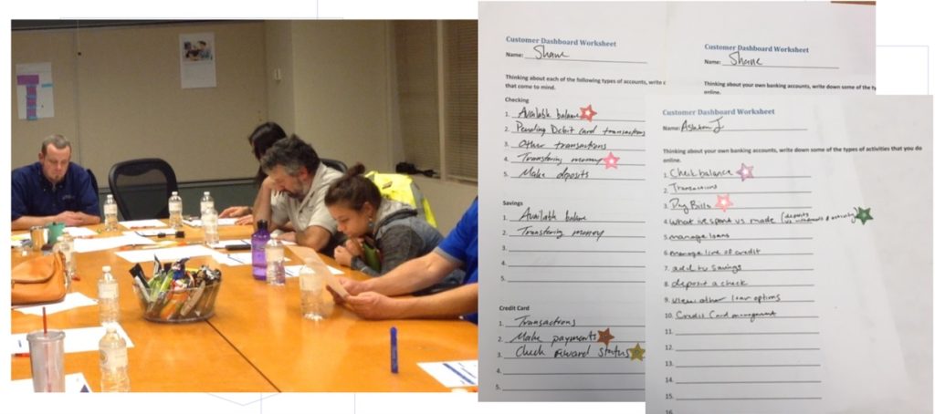
I worked with the product team to understand key challenges, define objectives, and craft a screener to recruit the right participants to come into our facility.
I prepared materials and activities prior to the sessions to help facilitate active and thoughtful participation.
During the session, I guided them through a series of simple design activities.
There were three main activities for participants: a warm up exercise, a small group design activity, and a final presentation to the large group.
1. Warm Up
The session kicked off with introductions and an icebreaker, followed by a brainstorming activity to get participants thinking about their banking needs.
2. Design the Dashboard
After the warm up exercise, customers were split into small groups. Each group was given a persona and they were instructed to design the dashboard from the perspective of that persona. This helped the groups focus conversations on the needs of this particular user profile versus driving discussions based solely on their own needs and experiences.
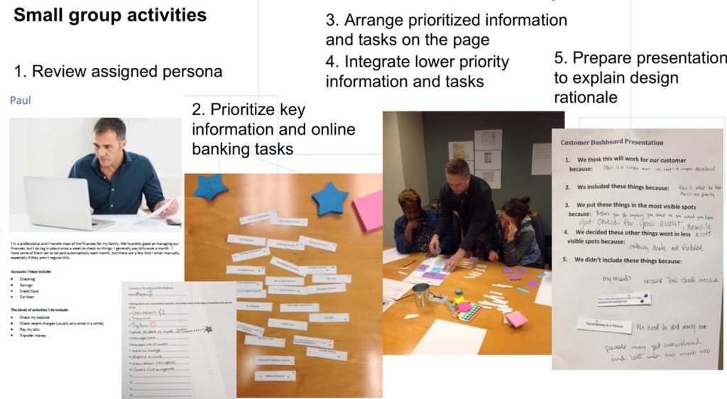
3. Share the Rationale
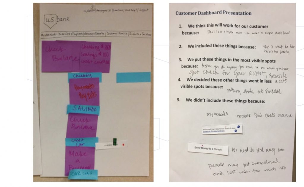
Each small group was provided a template to help them prepare a brief presentation to share the rationale behind their design decisions.
- We think this will work for our customer because …
- We included these things because …
- We put these things in the most visible spots because …
- We decided these other things went in less visible spots because …
- We didn’t include these things because …
Next, everyone was brought back together and each team presented their concept and shared their thinking behind the design.
Outcome
Firstly, the product team found the sessions very insightful. They had been making decisions based on comments coming back in customer surveys, and found it tremendously valuable to hear directly from a group of users with varied needs and perspectives.
Next, using key insights from these sessions, the designer created early concepts and I tested those concepts with a large audience through remote, unmoderated testing. With the results from that study, requirements were defined and new dashboard was launched within a year through a series of incremental changes.
Customer satisfaction scores increased and, over the next few years, many ideas that surfaced or were triggered as a result of this work, continued to be incorporated into the overall site.